Objectives For Today
- Excel For Exploratory Data Analysis (EDA)
What is a Terminal?
Some folks are confused over some pre-work activities in your Windows machines, and I’m going to demystify some of it.
- It is the graphical user interface (GUI) that we interact with the computer by giving it commands.
- How you use commands is highly dependent on the operating system (OS) itself, and in our case, we have Windows vs MacOS (Unix) vs Linux:
- Microsoft and other companies were trying to compete in terms of standards, and thus Windows commands look vastly different from MacOS (Unix) or Linux-based commands.
- The other companies are winning in terms of adoption rate of their standards against Windows machines because Windows wanted to charge per license and the other companies are doing it on open-source.
- Thus Microsoft is also adopting Linux commands in future iterations of their terminal.
- MacOS is a flavor of Unix adopted from Apple, and Linux was created from Unix, thus their commands and syntax look similar.
- Git bash is the linux version on Windows, and we use that because the Linux subsystem within Windows isn’t exactly mature.
How does this impact you?
- Many companies use Macs for work simply because the servers we deploy are usually open-source.
- This means it seems easier for Mac users to run code and commands, and thus Macs are highly recommended.
- There are exceptions to this guideline, as there are machine learning (ML) libraries that only work well with Intel-based chips (PCs) and Nvidia GPUs, and so if you’re into ML, it is fine to use Windows.
What is EDA for and why?
In today’s lessons, we aren’t only discussing about Excel, but how you can use Excel to perform simple exploratory data analysis (EDA) using some basic statistics.
EDA is a preliminary profiling and rough analysis of the data to see:
- If we have the requisite data coverage and depth needed to our desired outcome.
- Finding gaps within data is commonly known as Data Gap Analysis (DGA), but sometimes EDA uncovers data gaps as part of the profiling.
- Highlight trends and patterns within the data that would meet our business objectives and outcomes.
- Explore preliminary techniques to get a head start and a level of confidence in our subsequent approaches.
Why is this important?
- It is to reduce the risk of investing too much time and effort where you could be climbing the wrong tree that doesn’t give you the outcome and value you want.
- Example:
- In data science, we run the risk of going down a rabbit hole for too long when we are invested in one specific approach.
- When we had to come up with a soccer prediction model, I asked my data scientist if he wanted to start with team statistics vs individual player statistics to predict the outcome of a game.
- At work, speed to market is crucial. You can’t spend too long to develop a model that you want for your product as overhead costs compound.
- If you use team statistics as your starting point, you’ll get a model faster than analysing individual players. However, your accuracy will nosedive because the deciding factors of winning a match may be dwarfed/diluted by over generalization.
- If you use player statistics, it is much harder to build a model as you have more parameters and context to consider. Not every player’s role in a team is equal, and we run a high risk of analysis paralysis.
- Your EDA will depend on the context of the outcome and data you’re looking for, and this is highly dependent on the industry that you’re working in.
You don’t need a sophisticated tool to get EDA done, although BI tools (Tableau in Week 18) and Python libraries have features that make EDA easy. Excel is sometimes quick and easy enough to get started.
Excel Playground
If you have been working in an office for some time, it is very likely that you used Excel. If you’re already proficient with Excel, do give room for other students to grow in it.
This is going to be first dips on how programming works.
Excel mimics some of the programming languages in terms of features, and so you will be more and more familiar with programming when you understand these concepts.
Functions
Programming is very similar to high school math, algebra. This is a good reference to start if you want to know how function works in math or programming: What is a function?
Named Ranges
Just a shortcut to select multiple cells with a simple expression rather than highlighting each cell individually.
This is especially useful if you want to cross reference certain formulas or values across different sheets, and you want to reduce repeating yourself and being prone to human errors.
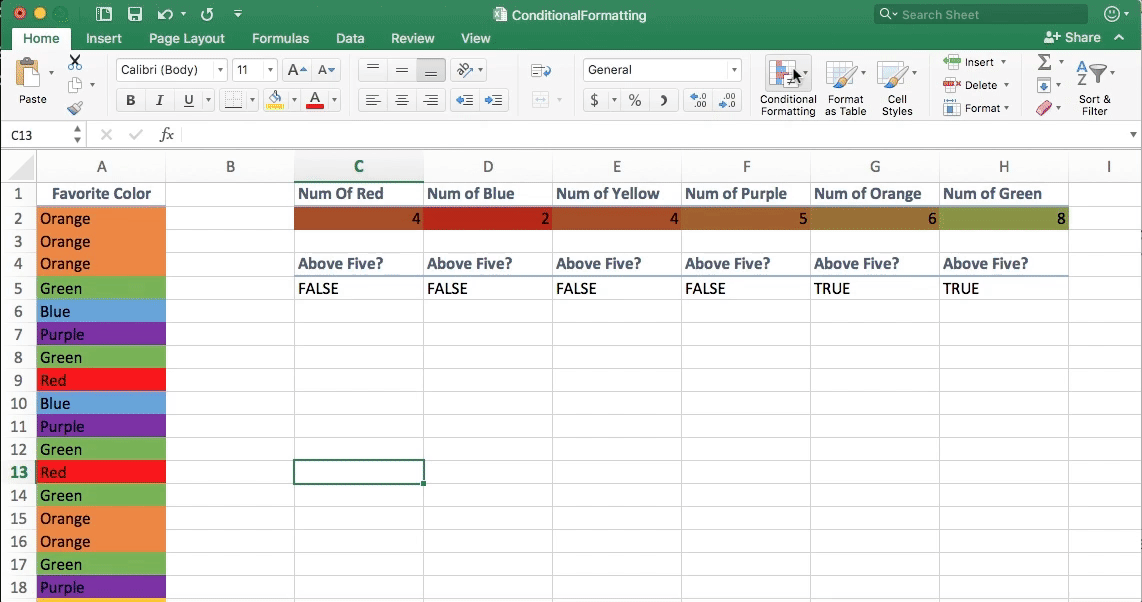
Color Counter
This is where we explore conditionals. Conditionals are core in any programming languages, and it is something we consistently have to think about when we code.
Logical Conditionals
- AND
- NOT
- OR
Conditional Statements
Examples:
- COUNTIF(A2:A5,”Red”): Counting if there is “Red” within the named ranges.
- IF(C2>5), “TRUE”, “FALSE”
Grade Book
Your turn to try an activity. We will review afterwards.
Learning To Learn
You’ll start realizing that I will put up additional videos and resources for you to read, because it can be fundamental for understanding.
I won’t be able to cover in-depth in terms of all the additonal resources as we need to keep time, and so you can learn about them offline instead.
Central Tendency
Why central tendency for EDA?
Being able to distinguish what is the norm versus what is an outlier is fundamental in problem solving.
- For example, bank frauds are outlier activities. Majority of bank customers don’t commit fraud.
- Banks use algorithms to identify fraud activity in a scalable and automatic function, so that they can maintain a high quality of service.
What are the common measures of central tendency?
Good reference if you need: Statistics Intro: Mean, Median, Mode
This may look basic, let’s remind ourselves what we are trying to get out of data: Value
- Mean
- Median
- Median
Mean
Arithmetic average of a dataset
What is the strength of mean in a dataset?
Simple way of getting summarized view of central tendency across the entire dataset.
What is the weakness of mean in a dataset?
Sometimes oversimplifies context by assuming every entity is equal.
Example:
- Household income is typically represented by median instead of mean, because a person’s high net worth can skew the central tendency dramatically. Such as Warren Buffett’s net worth.
Median
Selecting the middle element of a dataset
What is the strength of median in a dataset?
It is unaffected by extreme outliers, because it tends to ignore it.
What is the weakness of median in a dataset?
Outliers are ignored in the context.
Example:
- Minority representation of a data set is ignored because the data volume is small, and it is not represented within the central tendency report.
Mode
Selecting the most frequently occurring value as a representation of central tendency
What is the strength of mode in a dataset?
Frequency is usually a good indicator towards business outcomes.
What is the weakness of mode in a dataset?
Low frequency doesn’t mean less impact or consequences
Example: Crime data
- Severe offenses are usually low in frequency, but it can have a massive impact rather than several petty crimes.
There is no perfect, one-size fit all solution in data analysis. We have to pick the correct method based on the context you’re working in.
Group Activity: Measuring The Measures
If you are familiar with a dataset, you will know which measure of central tendency makes sense.
However, if you’re unfamiliar with a dataset, you will need to explore the data with all measures of central tendency.
This is a type of summary statistics.
Formatting
When you present your work to others, especially to folks outside of your team, you have to make sure that your spreadsheet is digestible and does not contain conflicting messages.
Example:
- I saw a senior engineer represented the value
100with green on the top of the row, and on the bottom,100with red, on an analytics dashboard. - Green is supposed to indicate a good result, and red is supposed to indicate a bad result. However, his report doesn’t have indicate negative values, i.e.
-100. And it was confusing to me what does the100mean.
Design is a solution, and it is not merely for aesthetic reasons.
How to set conditional formatting here:
Pivot Tables
Pivot tables are fundamental in Excel spreadsheets for quick analysis across multiple columns and rows.
Students Do: Top-Songs Pivot Table
Lookups
This is a prelude to SQL queries, where you have a column or row of values, and you want to associate data across 2 or more tables.
